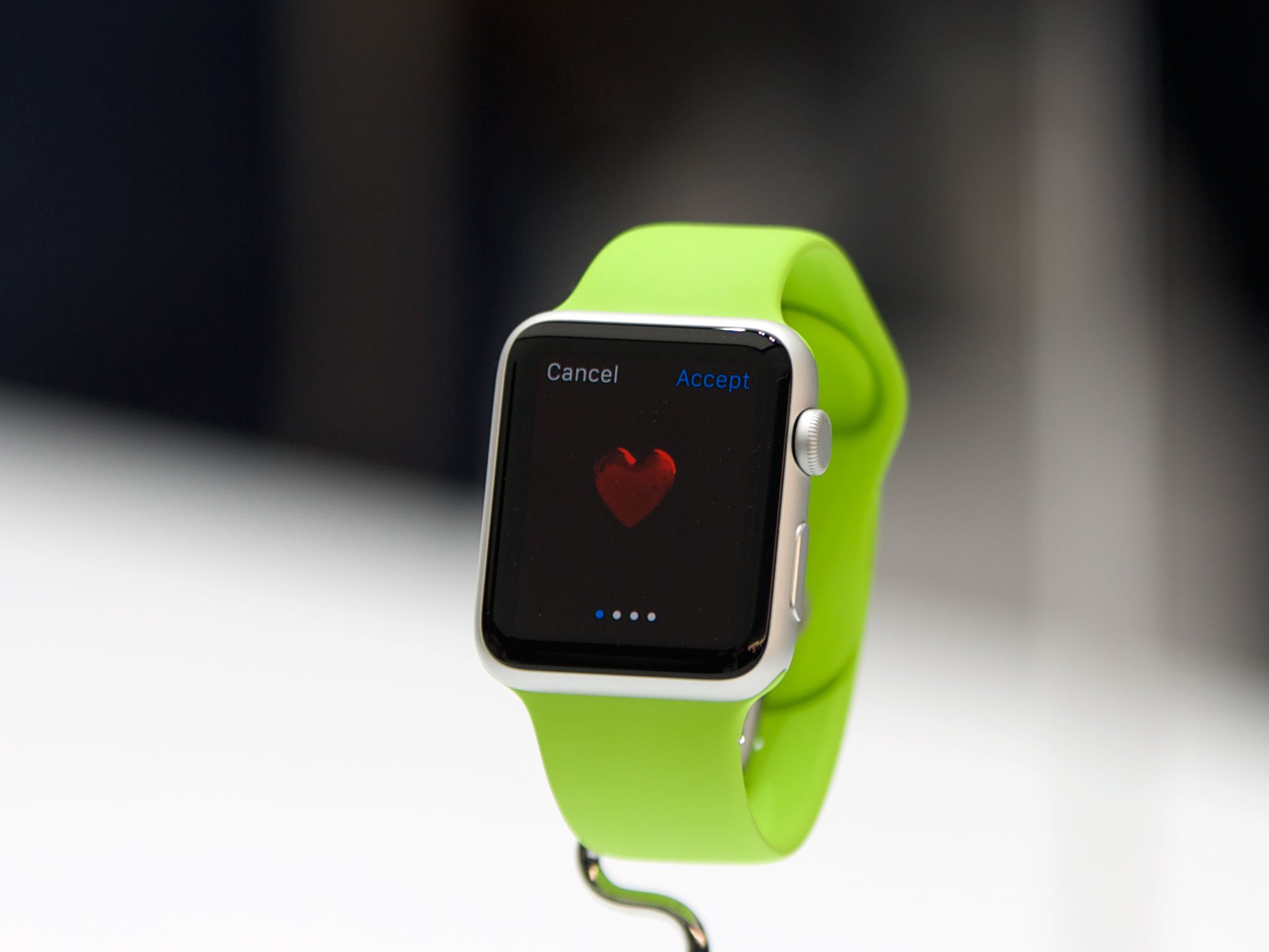
WIRED has published a new piece on the Apple Watch, citing an interview with Apple's human interface designer Alan Dye and VP Technology Kevin Lynch.
The article itself walks us through the birth of the Apple Watch project and how the idea was transformed into the resulting product that will launch later this month. Lynch was brought aboard to head up software development for Apple's new smartwatch, but when hired Lynch was completely in the dark as to what his responsibilities would be.
Apple not only changed the way we listen to music with the iPod, but the iPhone and iPad also mark times when Apple took product categories to the next level. The Apple Watch is believed to be that next game-changing product. Lynch talks about how Jony Ive, Apple's VP Design, tasked the iPod team to create a revolutionary device. This resulted in numerous experiments and ideas, some even utilizing click-wheels.
There were just experiments—the iPod crew had made something with a click wheel—and lots of ideas. The expectations, however, were clear: Apple's senior vice president of design, Jony Ive, had tasked them with creating a revolutionary device that could be worn on the wrist.
Instead of attempting to cram as much functionality into the smartwatch as possible – effectively rendering the smartphone useless – Apple opted to streamline tech usage. The idea behind the Apple Watch project was to introduce a product that would require only seconds of attention, allowing the wearer to focus on life in general.
Apple toyed with reworking iOS for the smaller wearable, but this idea was eventually dropped due to the user interface requiring uncomfortably long interactions.
Figuring out how to send a text was illuminating. Initially the process was a lot like texting on an iPhone: addressee here, message here, confirm message. Tap to send. "It was all very understandable, but using it took way too long," Lynch says. Also, it hurt. Seriously: Try holding up your arm as if you're looking at your watch. Now count to 30. It was the opposite of a good user experience. "We didn't want people walking around and doing that," Dye says.
This led to Apple removing features from the Apple Watch altogether, favoring efficiency over available functionality. Instead of physically interacting with the watch itself, the feature Short Look would be able to determine whether to mark a message as read or archive it for later reading by calculating how long you glanced at the device attached to your arm.
Every task on the wearable had to be completed within a set amount of time - just a few seconds. Minute details were also scrutinized, including different types of Taptic Engine feedback. Apple ran numerous prototypes by Ive, each to reveal different notifications to the wearer.
"Some were too annoying," Lynch says. "Some were too subtle; some felt like a bug on your wrist." When they had the engine dialed in, they started experimenting with a Watch-specific synesthesia, translating specific digital experiences into taps and sounds. What does a tweet feel like? What about an important text?
The team sampled sounds of various objects, everything from bell clappers and birds to lightsabers. They then began to turn recorded sounds into physical sensations. So – in some small way – lightsabers helped tune the Taptic Engine for notifications.
The Apple Watch is also the first product where the company is offering a variety of options for the consumer to customize their latest gadget. From the type of Apple Watch selected to the various bands and even screen sizes, there's plenty of room to make the watch reflect individual personalities, which was a major goal for the project to begin with.
Strongly recommended for you to read through the WIRED piece in full for more details and a sneak peek at various Apple Watch assets supplied by the company.
Source: WIRED


No comments:
Post a Comment