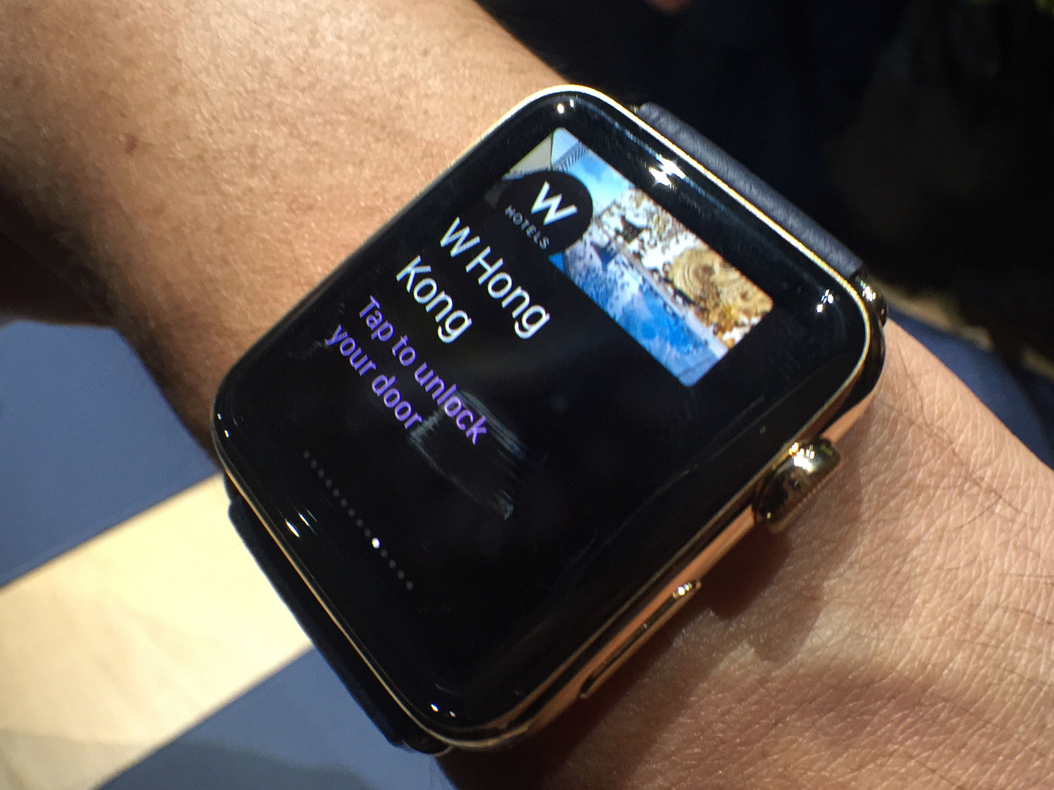
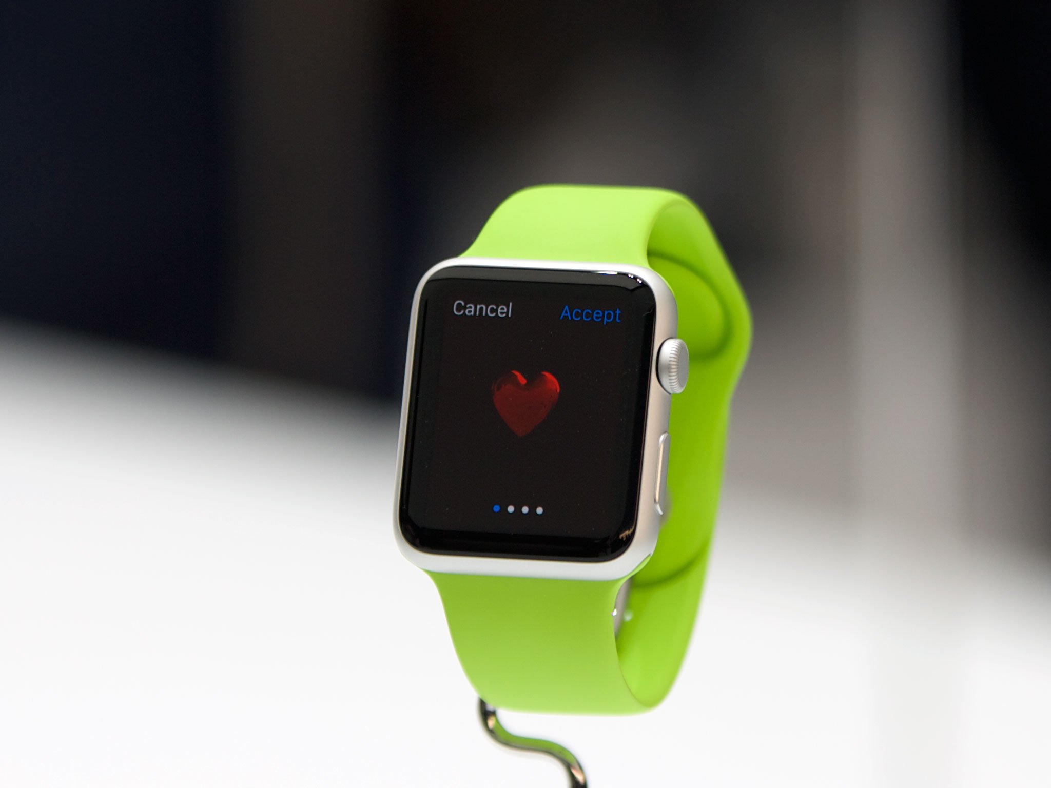
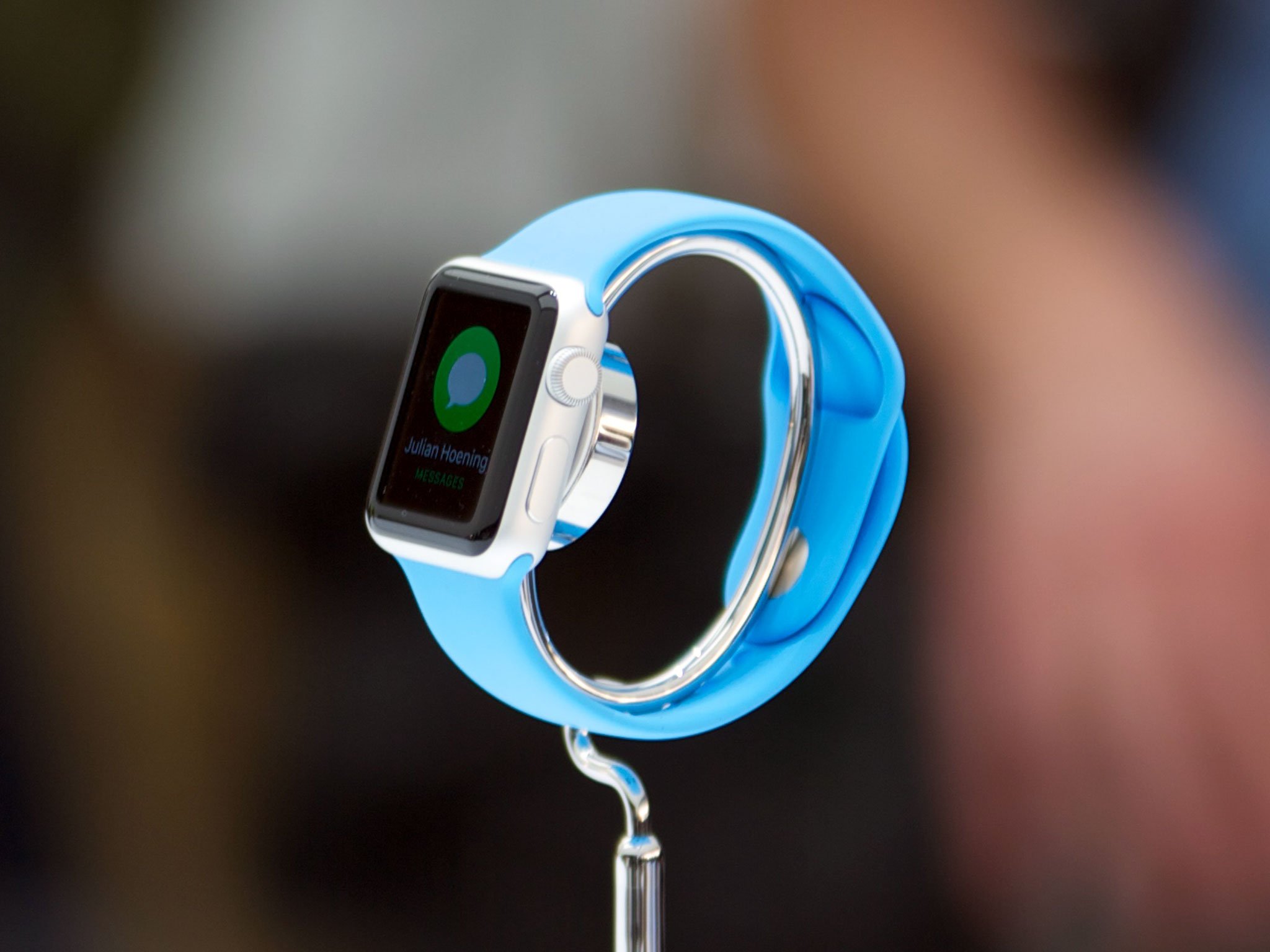
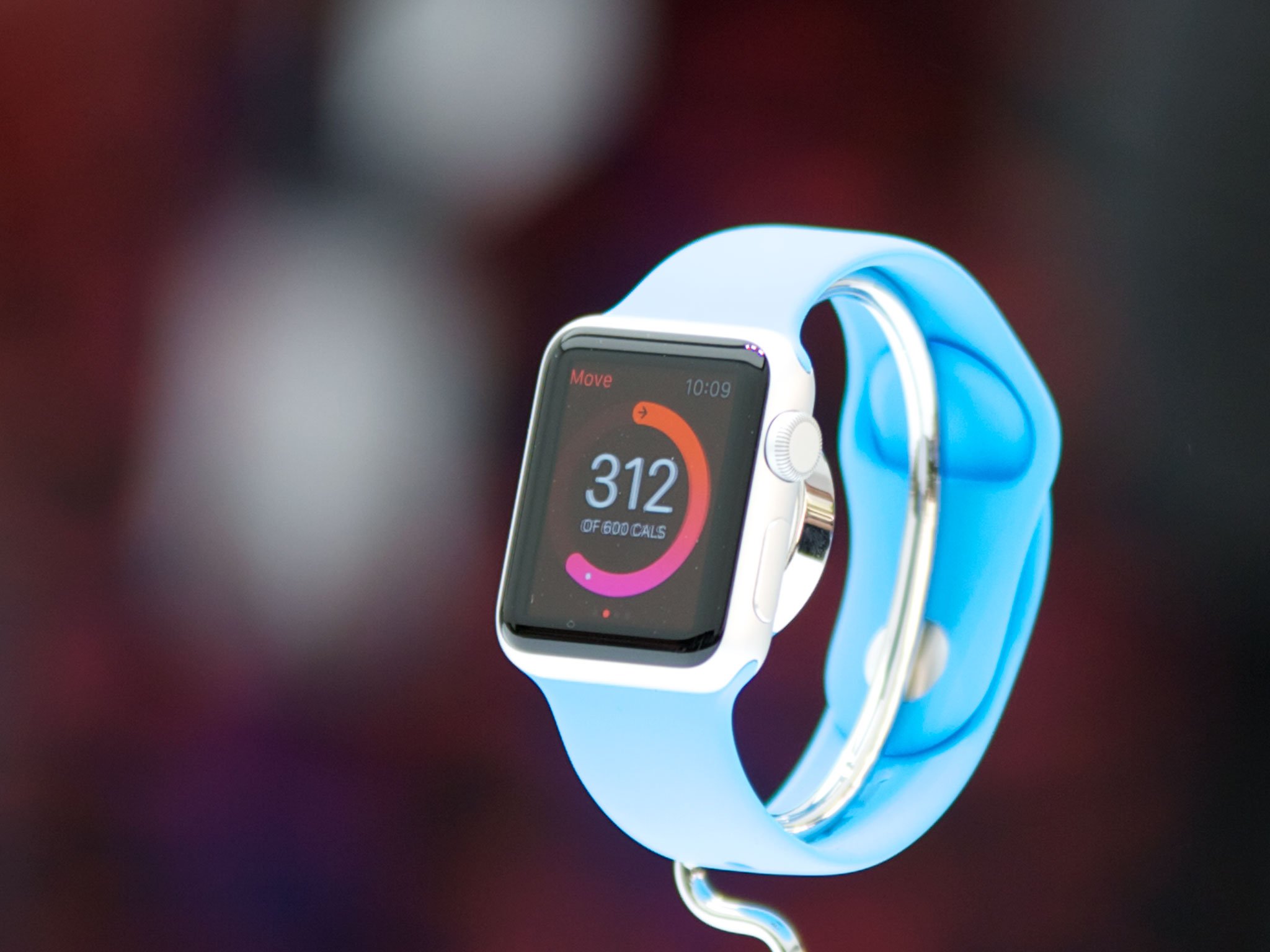
The Apple Watch will ship on April 24 — which means that, right now, developers and designers are hard at work on the first generation of Apple Watch apps.
Currently limited to actionable notifications (short and long looks), widgets (glances), and remote views (WatchKit apps), even though Apple Watch apps are bound to the iPhone, there's still boundless potential. I've tried several smartwatches and bands, seen most of what's on the market, and I've even been lucky enough to use the Apple Watch both back in September and recently again in March, where third-party apps were showcased. Those apps, the ones listed on the Apple Watch App Store apps page, benefited from time in the labs and testing on actual hardware. For those who didn't get that opportunity, after a lot of conversations with a lot of smart and experienced people, here's a list of things that are vital to keep in mind.
1. Keep it black
The Apple Watch's display is widely believed to be OLED. Unlike LCD, OLED is appreciably more energy efficient when displaying darker colors, especially black. Moreover, deep OLED blacks will better blend in with the watch's black bezels, making everything seem more open and expansive.
Apple's human interface guidelines (HIG) for the Apple Watch is emphasizing black, and you're going to want to follow it.
2. Keep it high contrast
There's a reason Apple is using terminology like "looks" and "glances". When an interface is on your wrist, the amount of attention you give it changes. Since you're not pulling it from your pocket or purse, or hefting it up from off the table, since it's not taking as much time to engage, the time spent engaging drops. That means everything has to be incredibly readable, and that means it has to be high contrast. On black backgrounds, bright text will show up clearly and bright colors will pop.
When you're only looking or glancing over for a second or two, having to stop and squint to try and visually and mentally parse information won't work. Everything needs to be presented clearly so it can be processed and understood quickly.
3. Keep it discreet
When a device is more intimate, its interactions have to be more important: Otherwise, it risks turning notification into interruption. Likewise, when a device is more visible, its interactions have to be more discreet: Otherwise it risks turning information into embarrassment.
In other words, your short look should never betray what your spouse thinks about your boss keeping you late, which controversial hashtag you're tracking, or anything that could be contentious or inappropriate at a meeting or at a dinner party.
4. Keep it brief
The Apple Watch has a small screen, making it ideal for quick bits of information and interaction. That same size makes it less than ideal, however, for long-form information or prolonged interactions. Likewise the weight of holding it up for anything more than a few minutes will likely cause discomfort.
So, show the critical stuff first, let people tap in for more, and then people use Handoff for anything truly in-depth or long in duration, so they can immediately pick up and continue whatever they need to on a bigger, more powerful device.
5. Keep it consistent
Looks and glances are each appropriate for different types of information. Looks are for temporary notifications; glances are for persistent data presentations. If you need something temporary, go with a look. If you need something persistent, go with a glance.
If they go to a glance, they want to see something. Just like a notification shouldn't stay stuck on the screen, a widget shouldn't ever empty out or vanish.
6. Keep it simple
Interactions with WatchKit will be more reactive than active. We'll spend far more time engaging with looks than hunting around for third-party glances or apps. That means notifications will be the primary gateway for most software, and they'll need to be polished and perfected. Glances, by contrast, will only need to be considered when data truly needs to be available all the time, and WatchKit apps only when interactivity is needed beyond what a glance can provide.
You don't need to have all of them, you'll need to have the most appropriate one(s), and have them perform incredibly well.
Bonus: No force-hamburgers
Force touch is a way to bring up extra, contextually-sensitive options. It's not an analog for the "hamburger button" — a way to bury a basement-full of unrelated functions.
If you feel yourself force touching, and start smelling burgers, step away from the Apple Watch and head for the joint of your choice. Then come back and pare down the options to the essentials.
Bonus II: Rules are made to be broken
Best practices are just that — best, not only. Great designers, the ones who truly understand their mediums and their messages, can and will break rules all the time. This list is meant to help, not to constrict — to make think, not to stifle. Take what makes your app better, reject the rest.
Bottom line
Come this April, we'll be surprised and delighted by what we get to see and use on our wrists. WatchKit apps work in tandem with the iPhone, and the developers and designers who make iPhone apps have had years to hone their chops and their craft. Developers who aren't sure of what to do or how exactly it'll all work simply have to wait for the Apple Watch to hit the market, get one, and and then test and tweak their apps on it until they shine. Because when it comes to the Apple Watch, shipping great experiences is going to be far, far more important than shipping on launch day.
- WatchKit on the Apple Developer portal
- Designing for the Apple Watch
- iPhone 6 and Apple Watch roundtable
- As I learn WatchKit
- Convenience — Apple Watch's killer feature
Originally published February 15, 2015.


No comments:
Post a Comment